BRANDING

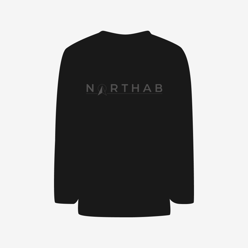
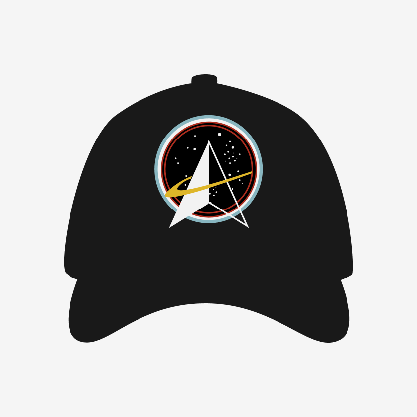
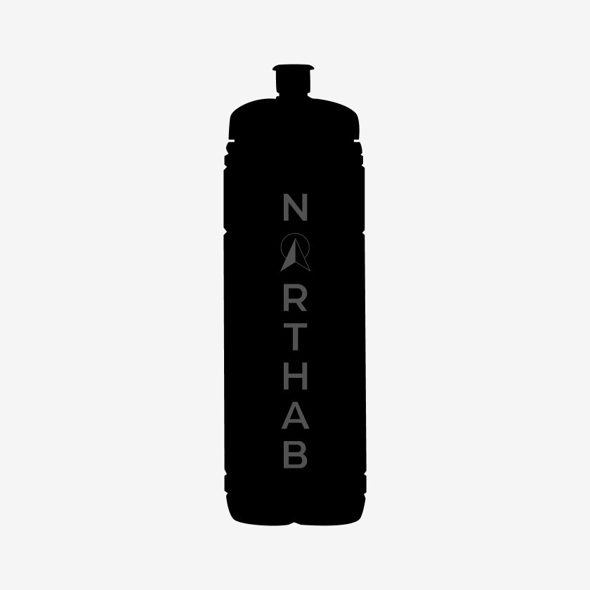
NORTHAB
The project involved creating logos and marketing materials for NorthAB, with the goal of producing prints for products tied to a hockey team they sponsored. The responsibility was to meet the client's marketing needs while balancing the requirements of the printing company and ensuring the logos worked across different applications.

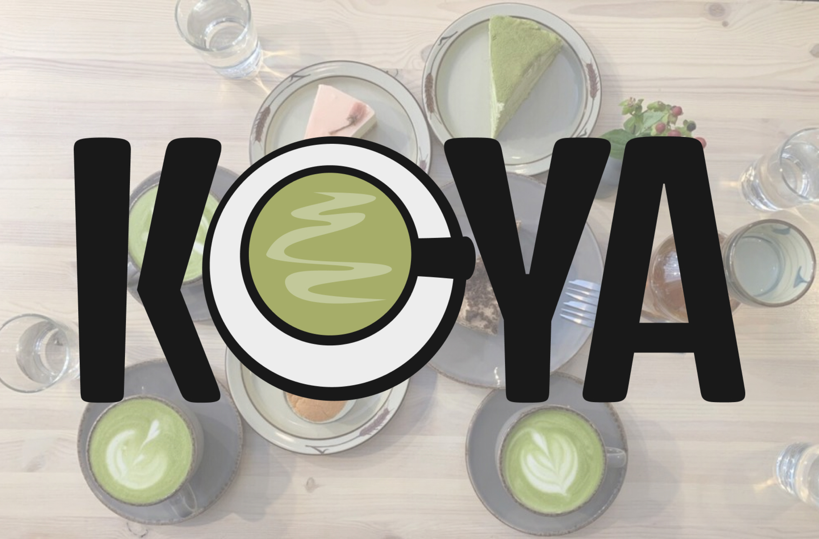
CAFE KOYA
The focus when creating the Cafe Koya logo was to convey a playful attitude while maintaining a subtle Japanese influence through the typography. Since matcha is deeply rooted in Japanese culture, it became a key element of the brand identity and shaped the overall direction of the logo design.
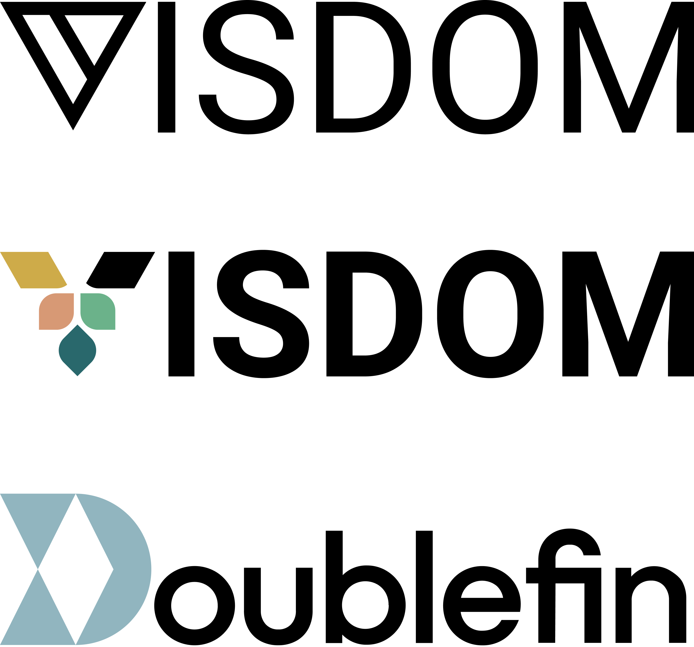
DOUBLEFIN
The Doublefin logo went through several transformations, partly due to product name changes over time. These shifts reflected the company itself and its evolving ownership, where direction and priorities could change quickly. As a designer, I valued this dynamic environment — it allowed many ideas to be explored and realized.
A recurring concept in the brand identity was tying the logo closely to the product name, often by emphasizing the first letter to make the brand more memorable. Community and inclusivity were also important values, which led to the middle logo version featuring multiple shapes and colors.
In the most recent version, trust became the key focus. This was expressed through more structured, angular forms and the use of blue, reinforcing a sense of stability and reliability.