WEB DESIGN

CAFE KOYA
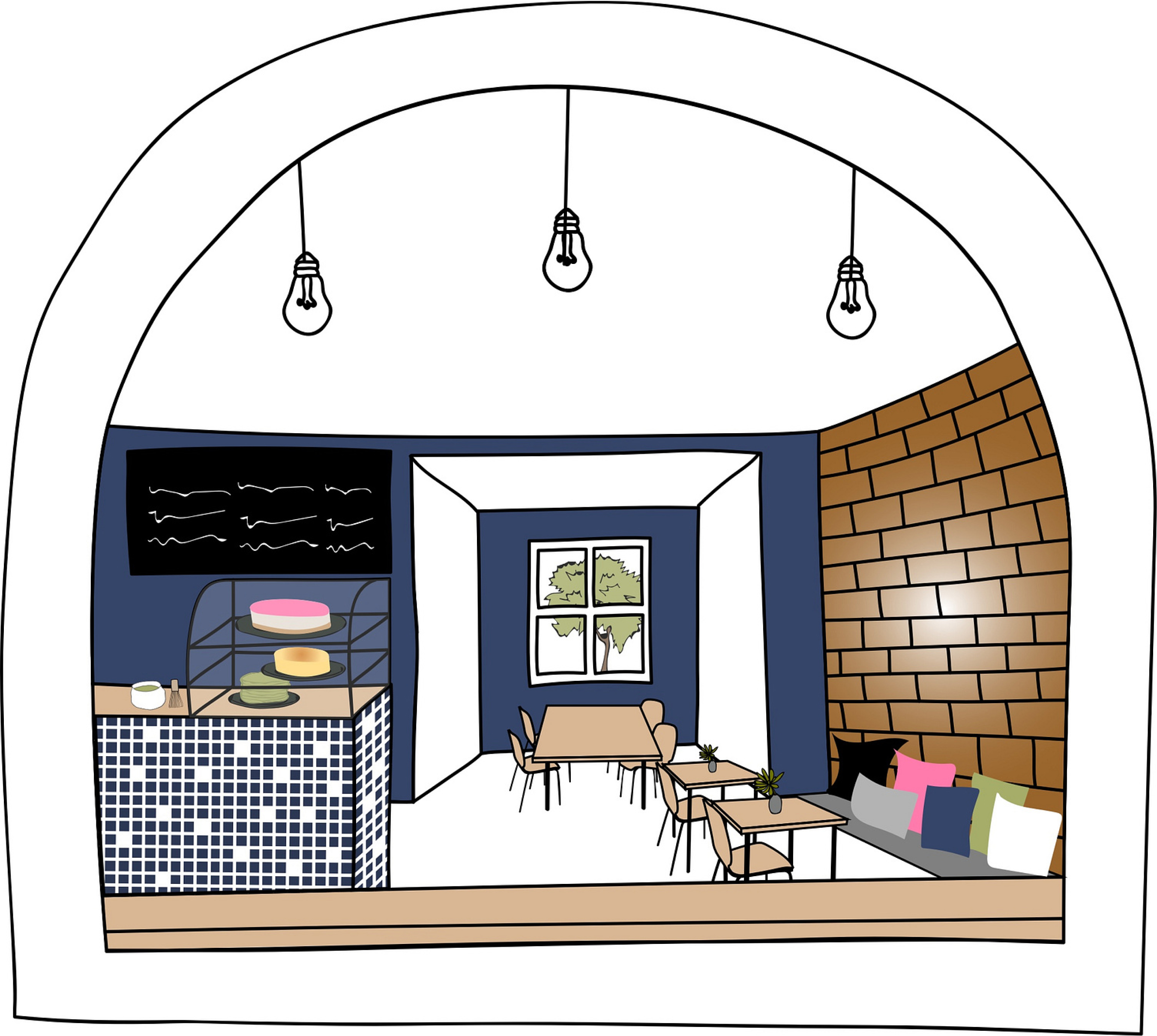
Cafe Koya is a Japanese-inspired cafe in Stockholm, blending a cozy Asian atmosphere with playful charm, tasty pastries, and fresh dishes. The project goal was to build their website from user research to a finished product, including a brand refresh. The tools used were HTML, CSS, JavaScript, and Adobe Illustrator, with all details hand-drawn in a playful spirit. CAFEKOYA.SE

BRANDING
The website has made a significant impact on the business, which has since gained a strong following. This is partly due to the exceptional quality of their pastries, but also because the site clearly communicates their concept and brand to customers.
MATCHA
Matcha has been central to Japanese tea culture since its arrival from China during the Middle Ages. Its flavour is bold, with a natural sweetness and very little bitterness. As a key specialty of the cafe, it deserved its own dedicated section on the website.

CAKE MAKING
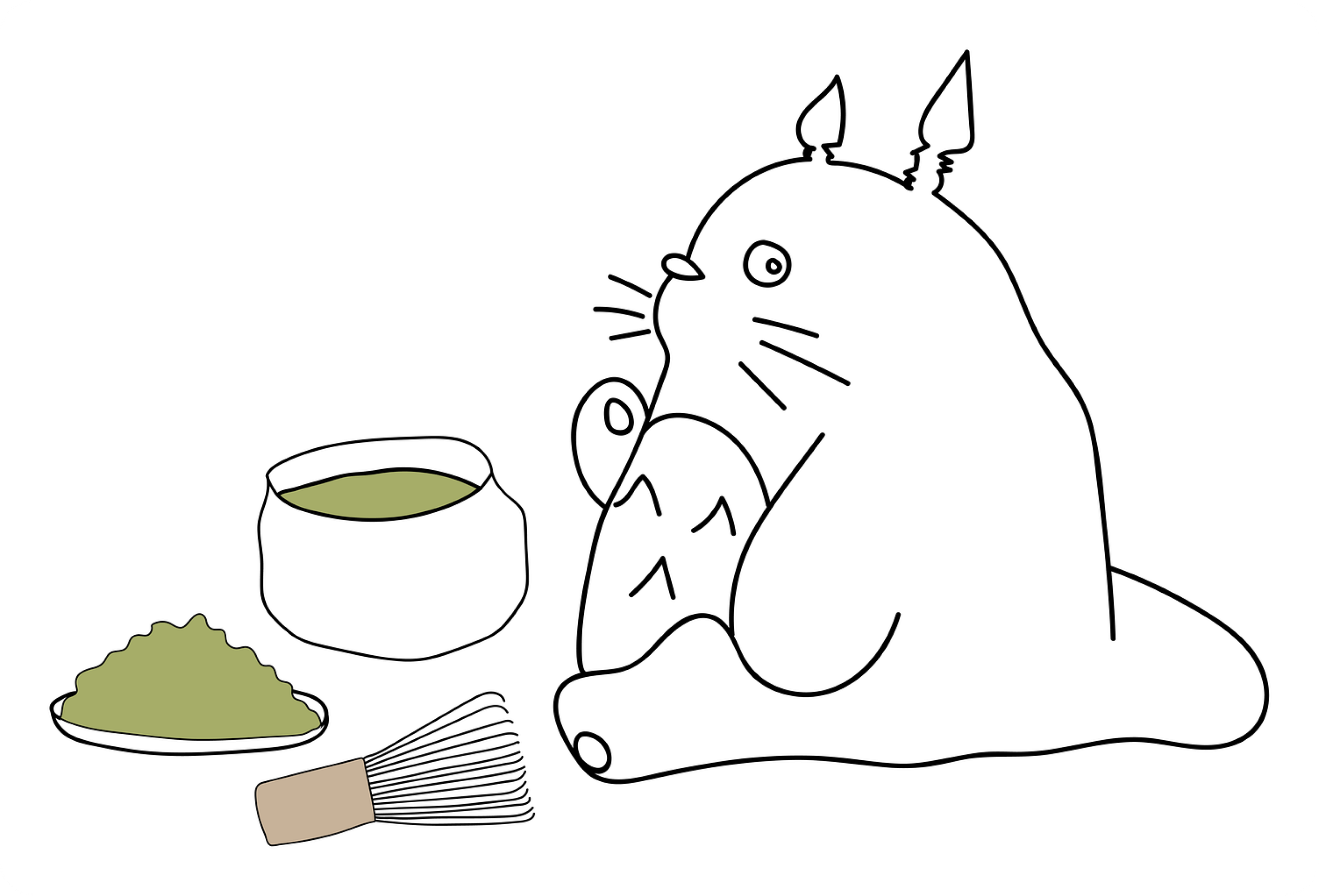
To capture the playful spirit, I added illustrated animals working in the cafe — helping out and reflecting the personality of the baker and owner. During user testing, customers often reacted with "Oh, cute" or "Lovely" when they saw the illustrations, and felt inspired to visit. That's when I knew I had found the common ground between the customers and the owner.

PLAYFUL ICONS
The icons needed to match the hand-drawn style of the page, so I created them in Adobe Illustrator. Connecting all visual elements into a cohesive whole is essential — it creates a seamless experience that builds trust with the user.
