DESIGN SYSTEMS
DOUBLEFIN
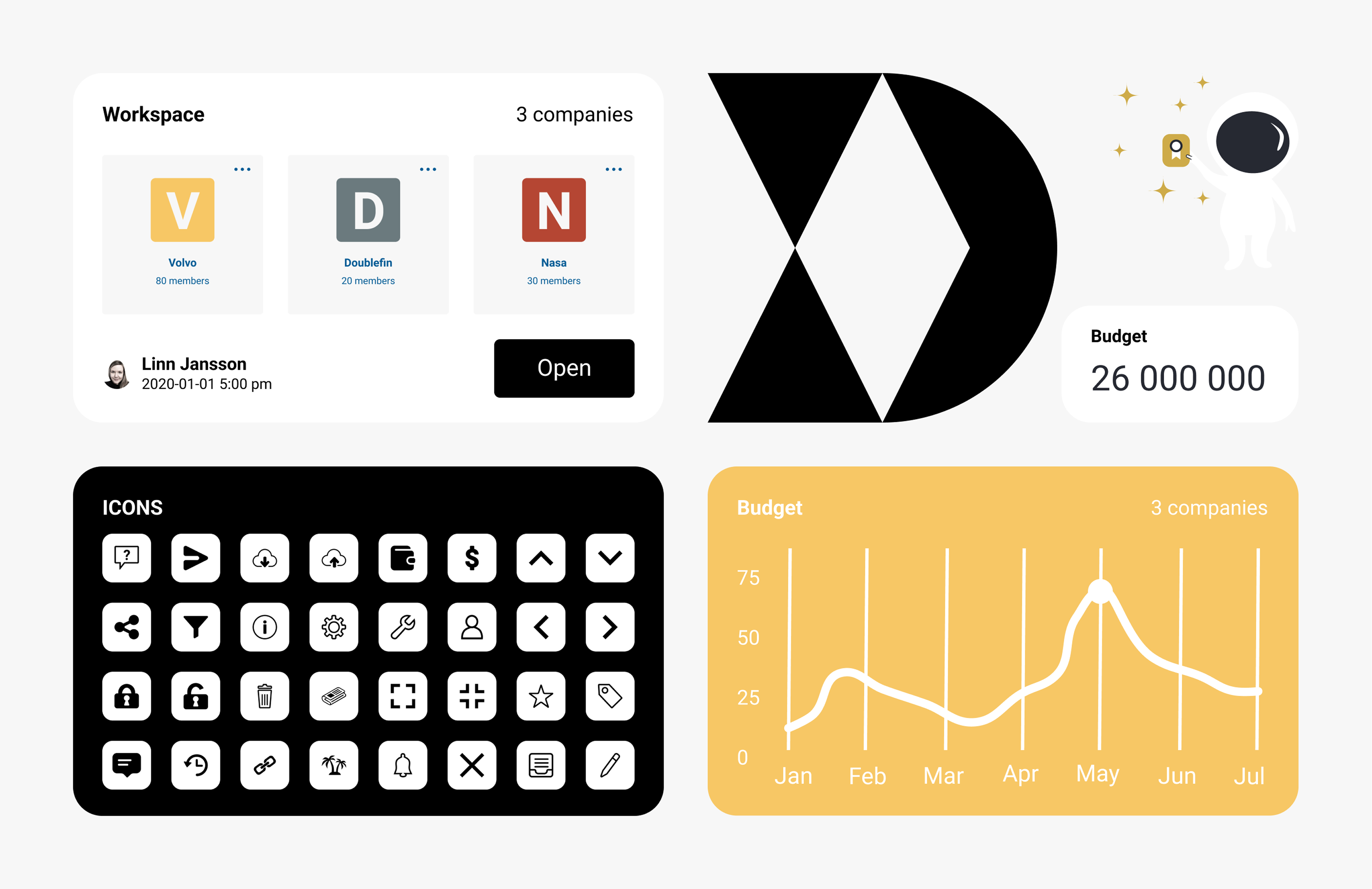
Budget tool with a collaborative headcount management and planning platform for teams, Finance business partners, and budget owners. For doublefin, I worked with creating design from user research to pixel perfect wireframes and high fidelity prototypes delivered to the agile team that was active in Sweden and large parts of the world. I also created their design system based on the WCAG.2.2 standard. Discovery was a big part in my role, in meeting the user's needs as well as the stakeholder's vision.
COMPONENTS
The components were designed in Figma and implemented in Storybook through close collaboration with the frontend developers in the team. The work began by focusing on the components with the greatest impact and expanding outward to ensure the entire system was covered.
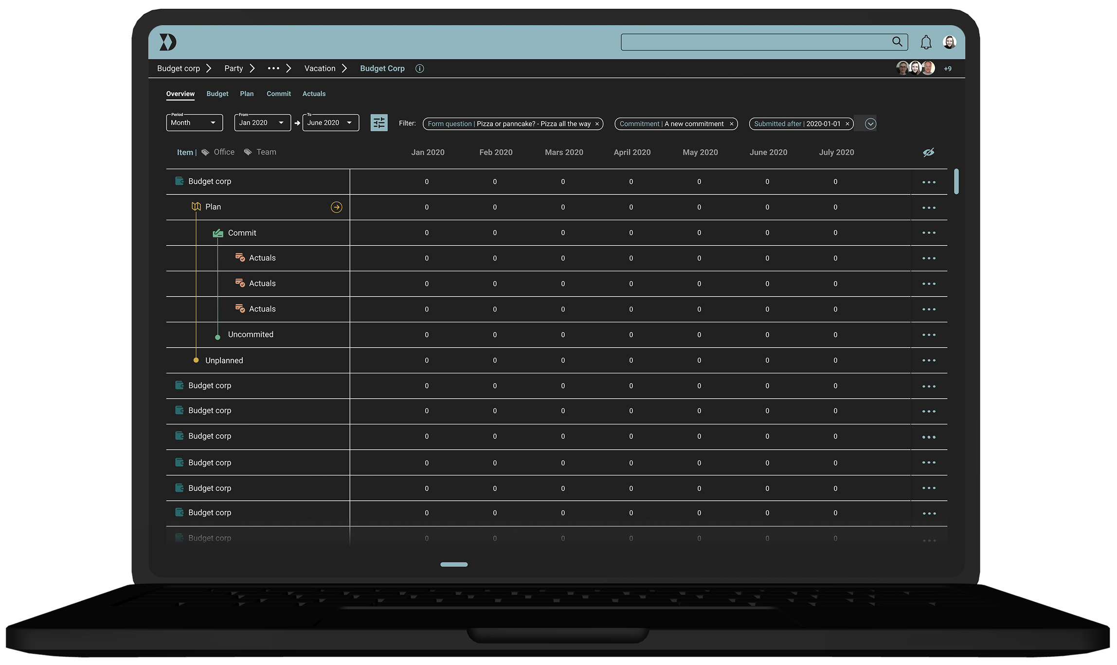
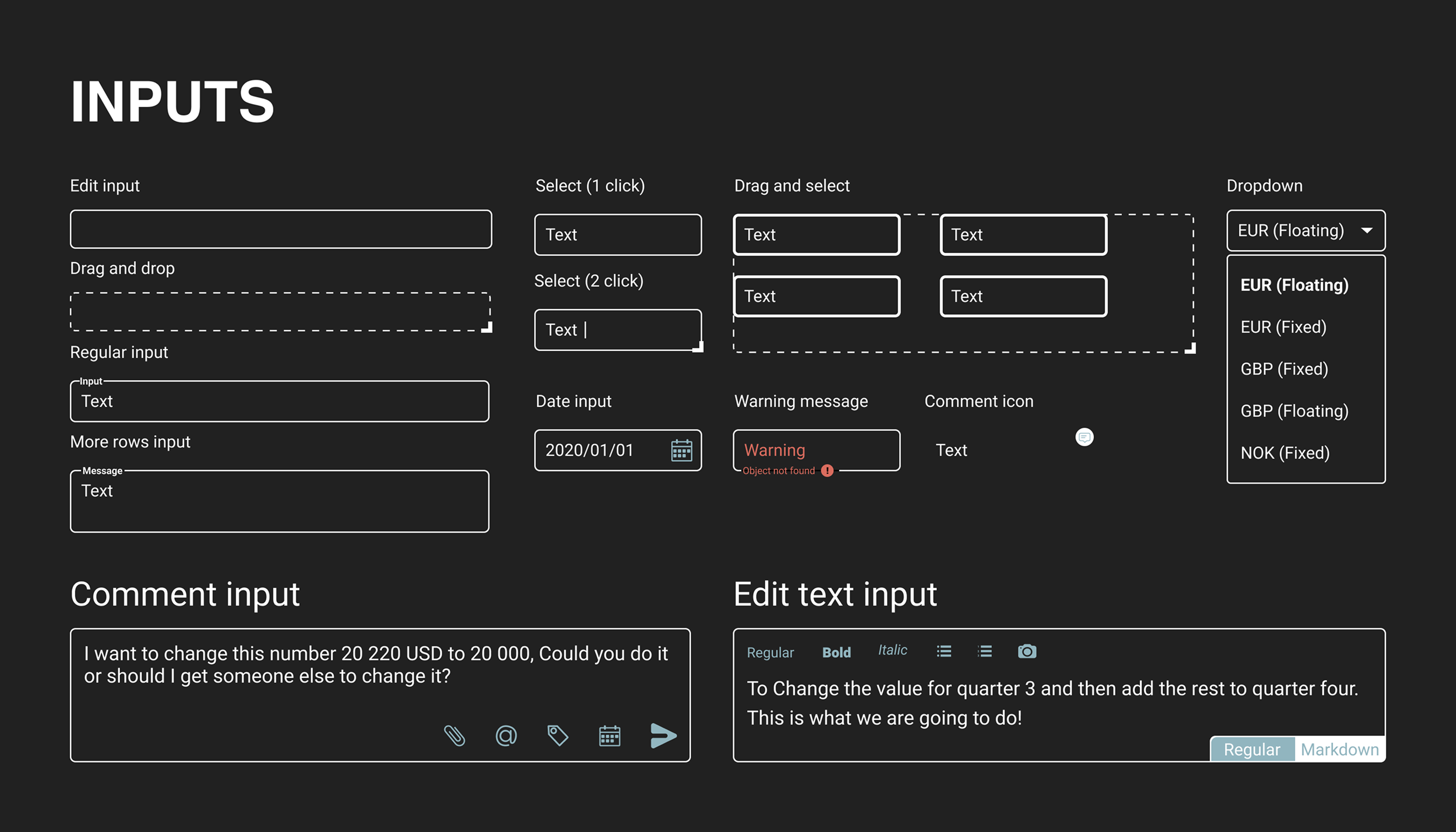
The most critical area was the main page where budget calculations were performed. In this budgeting tool, inputs were not simple fields but elements used by multiple stakeholders across different processes. This required inputs to support several states and clear communication through message flows within limited UI space. Accessibility was also a key focus, including defining button states to support keyboard navigation and ensure users could clearly identify the current state.
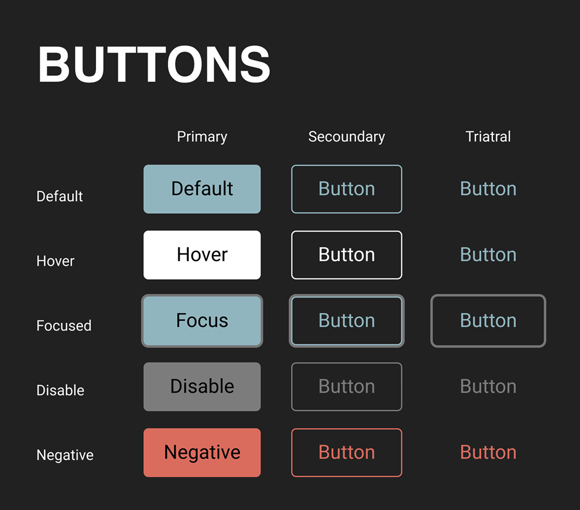
COLORS
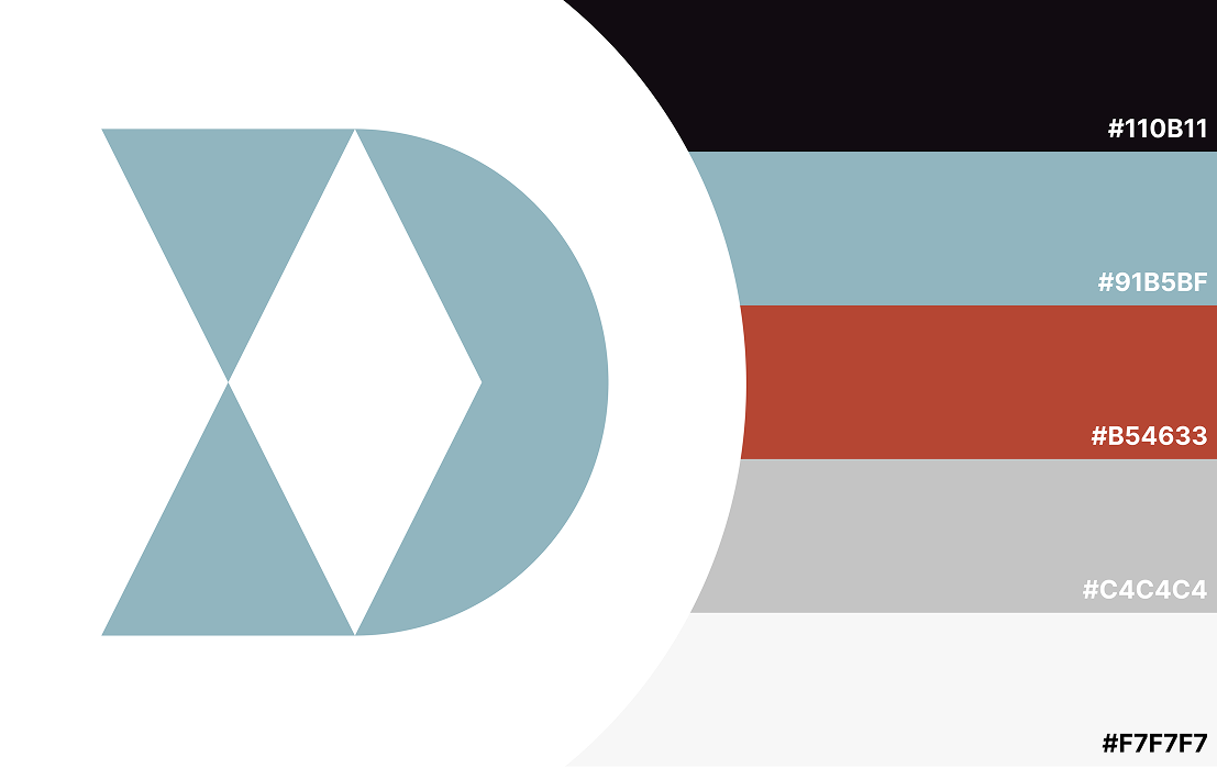
Color plays an important role in creating balance within a product and shaping how users feel when interacting with it. In Doublefin, the color palette was designed to evoke a sense of trust and community. Blue was therefore chosen as the primary accent color, as it naturally communicates reliability, calmness, and stability. This helped reinforce the overall emotional tone of the product and support a reassuring user experience.
ICONOGRAPHY
Icons were widely used in the product from the beginning, but many of them required refinement to better reflect their intended meaning and symbolism. Part of the work involved reviewing and improving the iconography to ensure clarity and consistency across the interface. To strengthen the communication of each function, icons were often paired with text, particularly in menus, to make the purpose of each action clearer for the user.
MESSAGING
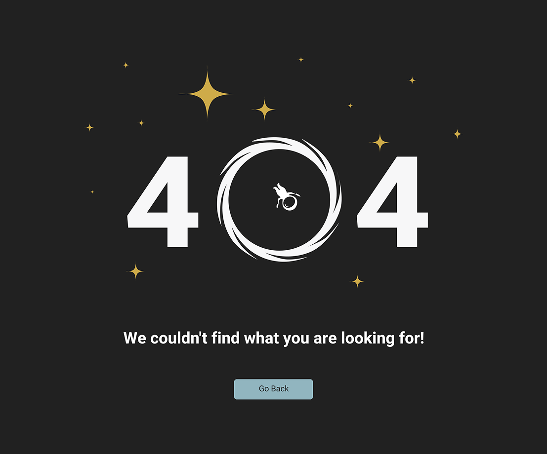
The idea behind introducing messages was to break the traditional tone of budgeting tools and make the experience more personal. The focus was on building a relationship with the user so they would feel a sense of connection rather than only the seriousness typically associated with financial tools. In situations where something went wrong, the concept was to introduce a small character that would "be there with you."
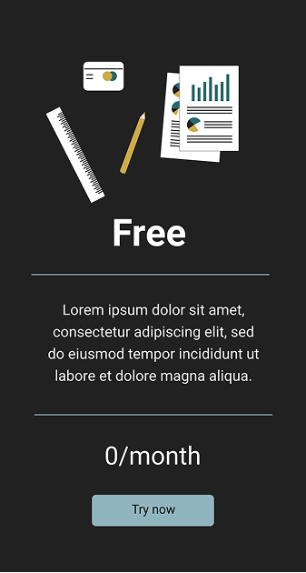
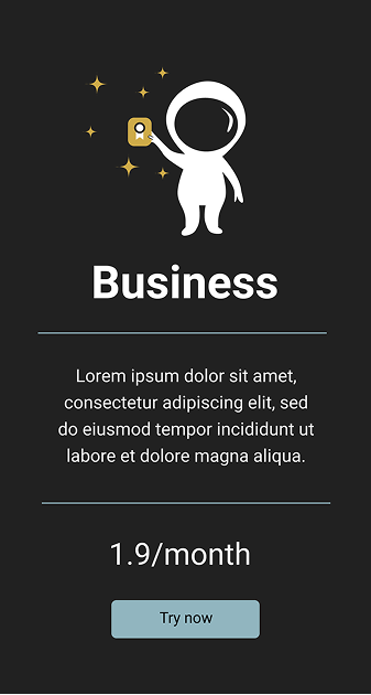
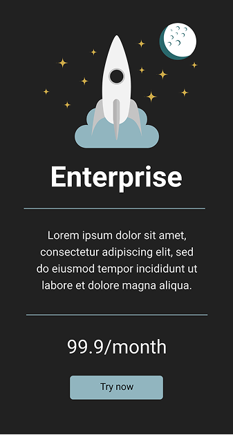
Similarly, when a user chose to subscribe, the messaging reinforced the feeling of becoming part of something. This approach proved effective, as users responded positively and even felt a sense of joy when seeing the character, even when the message itself communicated a difficult situation.